
If your business invests in digital marketing, you require optimized, high-converting landing pages.
UX is the backbone of a perfectly designed landing page and better UX leads to more conversions.
So, how do you create a high-converting landing page? This article discusses the top seven pillars of effective landing page UX.
Key Takeaways:
- Effective landing pages hinge on a strong user experience.
- The seven pillars of successful landing page UX include usefulness, desirability, accessibility, credibility, findability, usability, and value.
- Tailoring content to match user intent involves a content gap analysis and understanding the buyer’s journey.
- Desirability is enhanced by applying psychological principles such as dynamic personalization, anchoring, visual storytelling, loss aversion, visual cues, reciprocity, progressive disclosure forms, scarcity, and emotionally resonant color palettes.
- Accessibility of the CTA is crucial, requiring clear text, high contrast, keyboard accessibility, proper spacing, and regular testing.
- Credibility is built through social proof and testimonials from satisfied customers. Findability ensures information is organized with clear headings, menus, and a functional search bar.
- Usability is maximized by aligning with key elements like learnability, efficiency, memorability, satisfaction, clarity, consistency, flexibility, and efficient navigation.
- Displaying the USP prominently emphasizes what distinguishes the product or brand from competitors.
- Continuous analysis and optimization are crucial for long-term success in digital marketing efforts.
Understanding Landing Page UX
Landing page user experience refers to the overall satisfaction and ease of use visitors experience when interacting with a specific landing page.
A positive landing page UX should have the following:
- Clear Value Proposition
- Engaging Copy
- Relevant Imagery
- Prominent Call-to-Action
- User-Friendly Design
- Mobile Responsiveness
- Social Proof
- Concise Form
- Urgency or Scarcity Elements
- Analytics and Tracking
Also See: Complete Guide To Create High-Converting Landing Pages for Startups
7 Pillars of Effective Landing Page UX
Here are the top pillars of high-converting landing pages:
1- Usefulness: Match User-Intent
To optimize your content effectively, it’s crucial to immerse yourself in your user’s perspective and perform a content gap analysis.
Identify the keywords and topics your competitors use on their landing page that you may be missing.
Consider the buyer’s journey when crafting content, tailoring it to align with the stages of the sales funnel and your users’ goals.
If possible, segment your audience based on their behavior and preferences. This allows you to deliver personalized CTAs and content, making the user experience more relevant.
Implement the right call-to-action and keywords that work perfectly with each stage of the user’s journey.
2- Desirability: Apply The Best Psychology Principles
To enhance desirability on landing pages, it’s crucial to apply psychology principles through design and content strategically.
Here are some of the best ways to apply desirability:
- Dynamic Personalization: Use AI-driven algorithms to adjust content. This creates a customized experience that resonates with individual user preferences, increasing relevance and engagement.
- Anchoring: Introduce the first piece of information that users will anchor onto when making decisions. Strategically placing the most important information, such as a discounted price or a unique selling point, can anchor visitors’ perceptions, influencing their decision-making.
- Visual Storytelling: Incorporate a visual narrative that guides users through compelling stories using images, graphics, and concise text. This helps capture attention, evoke emotions, and enhance the narrative flow, making the information more memorable.
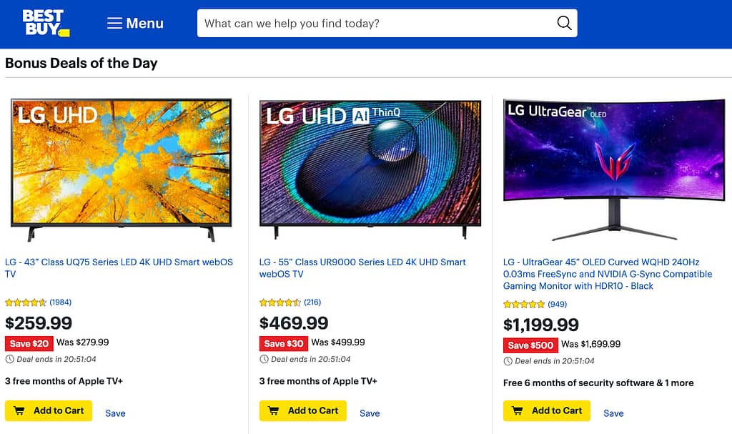
- Scarcity: Create urgency or limited availability for a product or offer. Highlight limited-time promotions or exclusive deals on landing pages, as this can prompt quicker decision-making and conversions as visitors fear missing out. For example, BestBuy displays a time counter to inform buyers that the deal will end in the next n hours.
- Visual Cues and Eye Tracking: Direct attention to key elements using visual cues, such as arrows, lines, or contrasting colors. This helps to guide users’ focus, influences navigation, and ensures important information is noticed.
- Reciprocity: It is the principle that people feel obligated to return favors. Offer something valuable, like a free resource or discount, as this creates a sense of reciprocity, encouraging visitors to engage further by providing information or making a conversion.
- Progressive Disclosure Forms: Use step-by-step or conditional form fields, revealing information progressively as users interact. This reduces cognitive load, makes the form-filling process more manageable, and increases completion rates.
- Emotionally Resonant Color Palette: Choose a color palette that aligns with the emotional tone you want to convey (e.g., calming blues for trust or vibrant reds for urgency). Colors evoke specific emotions, influencing how users perceive and respond to the landing page.
Also See: Best Marketing Consulting Agencies & Firms
3- Accessibility: Make Sure Your CTA is Accessible
The call-to-action or the CTA button is the most important element of your landing page UX.
To enhance the accessibility of your CTA, craft clear and descriptive text for the button.
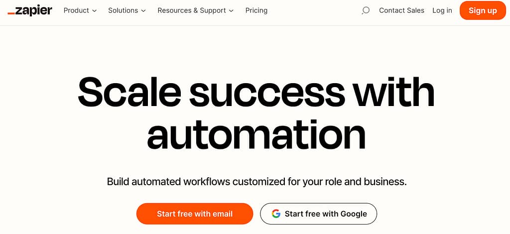
Additionally, consider the visual aspect using high-contrast color combinations between the CTA button and its background. This improves visibility, particularly for users with visual impairments. For example, Zapier uses a birght Orange colored CTA to maximize its visibility.
Make the CTA keyboard accessible to accommodate individuals with mobility challenges. This involves allowing users to navigate and activate the CTA using keyboard inputs.
Simultaneously, pay attention to spacing around the CTA to prevent accidental clicks and create a user-friendly experience for those with fine motor control difficulties.
This proactive approach ensures that users of diverse abilities can seamlessly engage with your CTA, fostering inclusivity in digital interactions.
4- Credibility: Add Social Proof and Testimonials
Add comments or stories from happy customers to make your landing page more trustworthy. Share what people like about your products or services.
Put these comments where people can easily see them, especially near the buttons where they can buy or sign up.
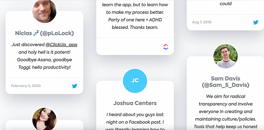
Use real names and pictures to show these comments are from real people. This makes your business seem more reliable. For example, ClickUp displays the pictures of real people to persuade visitors to try their tool.
Don’t forget to update these comments occasionally to keep things fresh and show you’re still doing a great job!
5- Findability: Your Visitors Should Be Able to Find the Information They Are Looking For
Keep things neat and organized to help people easily find what they’re looking for on your landing page.
Use clear headings and menus so visitors can quickly see where to find information.
Make sure the search bar works well, so if someone is looking for something specific, they can find it fast.
Use the words your target buyers might type into a search engine when looking for your page. Use those keywords on your page to help it appear in search results.
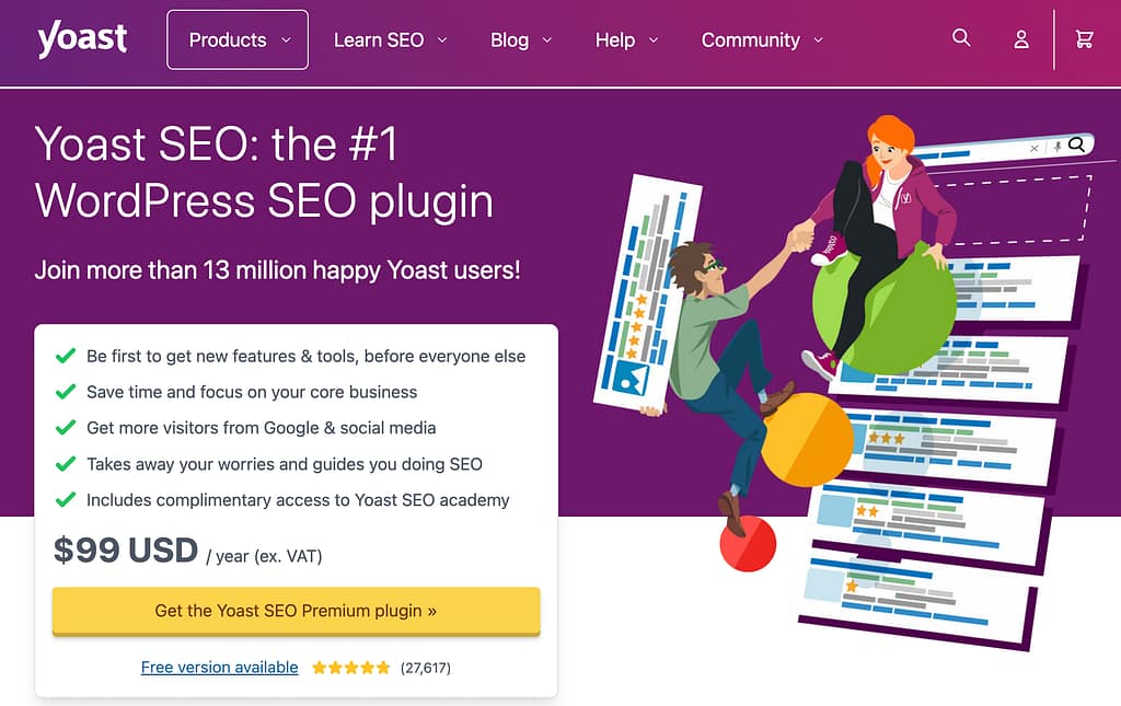
The Yoast SEO plugin page is a perfect example of a landing page that displays clear information as to what the visitor wants. They display the prominent keyword “WordPress SEO Plugin”, a clear CTA, and a collection of review to gain the trust of the visitors.
Also, ensure your page works well on phones since many people use them to browse.
Listen to what people say about your page, check how many people visit, and stay on it. This will help you know what’s working and where to improve things.
Also See: How to Make A Great Crypto Landing Page (Guide With Examples)
6- Usability: Your Landing Page Should Match All Elements of Usability
For optimum usability on your landing page, ensure that every aspect aligns with key elements of usability:
- Learnability: Design your landing page so visitors can quickly understand navigating and find information. Keep it intuitive, with clear headings and menus for easy learning.
- Efficiency: Streamline processes on your landing page, allowing users to accomplish tasks quickly and effortlessly. Minimize unnecessary steps and ensure straightforward navigation.
- Satisfaction: Prioritize user satisfaction by making tasks efficient and creating an overall enjoyable experience. Engage users with compelling content and a visually appealing design.
- Clarity and Consistency: Design with clarity, using easily understandable language and maintaining consistent navigation throughout the page. Users should be able to predict how elements behave.
- Flexibility: Cater to various user preferences by offering flexible options or settings. This could include customizable features that enhance the user experience based on individual needs.
- Efficient Navigation: Facilitate seamless movement through your landing page with logical information architecture and clear menus. Users should be able to navigate without confusion.
7- Value: Display Your Product/Brand USP Prominently
Your business’s unique selling proposition or USP is a key factor that sets your product or service apart from the competition.
Once your USP is ready, position it prominently in the headline to make it the first thing visitors notice.
For instance, you can feature your USP prominently in the hero section, the top part of your landing page that immediately grabs attention.
Use images, videos, or infographics that visually demonstrate your USP. Use visual elements to enhance the overall storytelling around your unique offering.
Include a section that specifically outlines the benefits tied to your USP.
Anticipate and address potential questions or concerns about your unique proposition for maximum benefit.
For example, Bamboo HR displays their USP prominently with a clear call-to-action.

Also See: Best Marketing Analytics Tools For Growth Marketers
Conclusion
By addressing these landing page UX design tips collectively, you can provide an engaging experience that meets buyer expectations.
Marketers should continuously analyze and optimize their landing pages, keeping the user at the forefront of design decisions to achieve long-term success in their digital marketing efforts.
FAQs
Why do we create landing pages?
We create landing pages to convince people to take a specific action, like buying a product or signing up for a service, by providing them with focused and compelling information.
What role does site speed play in landing page UX design?
Site speed is crucial in landing page UX design because it directly impacts how quickly visitors can access and interact with the content. Faster loading times enhance user experience, reduce bounce rates, and contribute to higher conversions, as people prefer swift and responsive pages.
Which are the top tools used to create UX-friendly landing pages?
The top tools for creating UX-friendly landing pages include popular website builders like WordPress, Wix, and Squarespace. Additionally, specialized platforms such as Unbounce, Instapage, and Leadpages are designed to create high-converting and user-friendly landing pages. These tools provide templates, drag-and-drop functionality, and various customization options to create high-converting landing pages.


