The promise of Web3 is decentralization, ownership, and user empowerment. But without a solid user experience (UX), that promise quickly falls apart. Web3 products often face friction right at the first interaction like connecting a wallet, switching a network, or understanding gas fees. This poor UX has been a key reason behind low user retention, slow adoption, and eroded trust in crypto products.
As the industry matures, Web3 UX design has become a core part of product-market fit. In this guide, we’ll explore the principles that define good design in Web3 space, and how to overcome the most common challenges crypto platforms face today.
Key Takeaways:
- Web3 UX goes beyond visual design. It includes onboarding, wallet interactions, transparency in transactions, and error handling.
- The decentralized nature of Web3 creates both opportunities and friction in user journeys.
- Good UX can drive trust, adoption, and long-term retention by making crypto more approachable.
Also see: Top Crypto Design Agencies
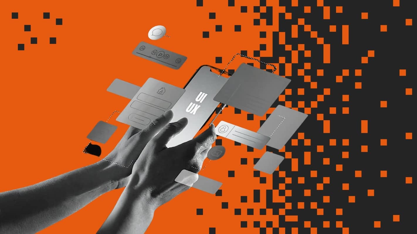
Understanding Web3 UX Design
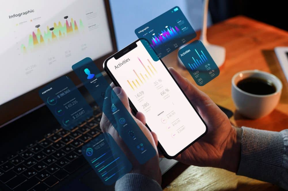
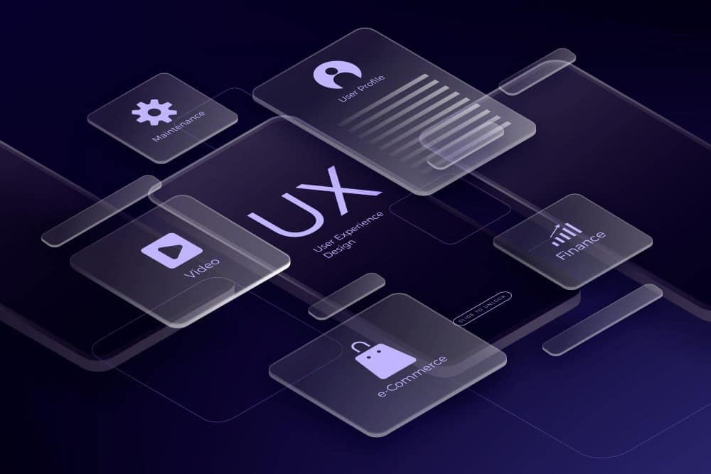
Web3 UX design is the practice of creating intuitive, user-centered experiences for decentralized applications (dApps) and blockchain-based products. Unlike traditional web design, Web3 UX design must account for unique challenges like wallet connections, transaction confirmations, gas fees, and smart contract interactions.
Also see: Top Smart Contract Development Companies
Web3 UX designers focus on bridging the gap between complex blockchain technology and everyday users.They design interfaces that make cryptocurrency transactions feel as simple as traditional online shopping, while maintaining the transparency and security that Web3 demands.
The key difference from traditional design lies in the environment: while traditional UX design works within centralized systems where companies control user data and transactions, Web3 UX design operates in permissionless environments where users own their assets and data through cryptographic wallets.
It’s important to differentiate UX (user experience) from UI (user interface). UI is the visual layout: the buttons, fonts, and design elements. UX is the overall feeling users get while interacting with your product.
In Web3, good UX design means helping users navigate unfamiliar technologies without confusion or fear.
Also see: Top Crypto Design Agencies
Reasons Why You Need a Good UX (User Experience) for Web3 Apps and Platforms
UX determines how easily users can interact with your platform, how confident they feel while transacting, and whether they’ll return. A well-designed experience lowers the cognitive burden of interacting with blockchain, which is often abstract and intimidating.
User-friendly interfaces build trust, as users feel in control and understand what’s happening. They’re more likely to complete actions, refer others, and come back. A strong UX in Web3 applications reduces churn, increases time-on-platform, and raises the likelihood of success for DeFi platforms, NFT marketplaces, DAOs, and other decentralized ecosystems.
Key Differences Between Web2 and Web3 UX
While Web2 platforms have had decades to refine seamless interfaces and standardized design patterns, Web3 is still evolving. Let’s break down how these differences show up in practice.
User Ownership vs Platform Control
In Web2, platforms like Facebook or Google own user data and control interactions. Users have accounts managed by the platform. In Web3, users control their assets, data, and identity via wallets. This shift creates freedom, but also increases responsibility—and risks—since lost keys can mean lost access.
Onboarding and Access Differences
Instead of signing up with email and password, Web3 platforms ask users to connect a wallet. This onboarding step is unfamiliar to most users and often poorly explained. At Coinbound, our team has helped several Web3 projects simplify wallet connection flows to reduce drop-offs and educate users on wallet security and usage.
Consistency Across Platforms
Web2 has established UI conventions. Users know what to expect from a button or a form. In Web3, every app seems to reinvent the wheel. This lack of consistency increases user confusion and creates learning curves across apps that should otherwise feel familiar.
Error Handling and Recovery
In Web2, if something goes wrong, users see helpful messages or get a second chance. In Web3, errors are often irreversible. Signing the wrong transaction can’t be undone. Missing or unclear error feedback can permanently damage trust.
UI Standardization and Design Patterns
Unlike Web2 where frameworks like Material UI and Bootstrap create consistency, Web3 lacks standard UI kits tailored to wallet flows or smart contract actions. Designers often start from scratch, which leads to fragmented and inconsistent user experiences.
What are the Core Principles of Good Web3 UX?
Designing for Web3 means going beyond aesthetic appeal. It’s about trust, education, and safety. Here are the principles you should build around.
Minimizing Cognitive Load
Avoid overwhelming users with blockchain-specific language and multiple steps. Interfaces should feel lightweight and intuitive, even if the backend is complex.
Break multi-step processes (e.g., wallet connections, staking flows) into digestible chunks. If something requires user attention (like a gas fee or chain ID), make it clear but concise, don’t bury them in terminology or tooltips. Fewer decisions and clearer options reduce user fatigue and increase conversion.
Use Progressive Disclosure Approach
Rather than dumping everything at once, introduce complexity as users deepen their engagement. Let them start simple and discover advanced features over time.
For example, let a user buy an NFT or deposit into a DeFi pool without forcing them to choose slippage tolerance or gas strategy upfront. Once they’re comfortable, offer expanded settings or detailed analytics. This approach helps prevent early abandonment while still giving power users the depth they want.
Prioritize Transparency
Users should never have to guess what’s going to happen when they click a button. If they’re signing a transaction, show exactly what they’re agreeing to—ideally in human-readable terms. If they’re approving token spending, clarify the scope. Display expected outcomes before final actions, and don’t hide gas costs or network changes. Clear UI leads to confident interactions.
Safety and Clarity are Two Important Elements
Before an irreversible action, show a confirmation and explain the consequences. Clear, friendly warnings go a long way in preventing costly mistakes. Color cues, iconography, and friction (like an “Are you sure?” dialog) can protect users from making hasty or uninformed decisions.
Avoid Technical Jargon as Much as Possible
Replace terms like “gas” or “slippage” with intuitive explanations. Even experienced users benefit from cleaner language, especially when interfaces are busy or time-sensitive.
The Design Should Reflect Trust
Use clean interfaces, helpful animations, and well-written microcopy. Even small things like button text and loading states can signal safety and professionalism. Microcopy (like “Processing your transfer…” or “You’ll need a wallet to continue”) can reduce friction and build user confidence. Avoid sudden transitions, vague labels, or non-functional buttons.
Optimization for Different Devices
Ensure your app works across desktop, mobile, and tablets. Wallet flows should be responsive and touch-friendly, especially for mobile-first markets. Touch targets should be large enough for fingers, and transactions should be clear and confirmable on small screens.
UX Should Support Secure and Compliant Interactions
Be clear about permission scopes when asking for token approvals. Differentiate actions like “approve,” “sign,” or “transfer” visually so users don’t get tricked into giving excessive access. These cues reduce the risk of user error and help build regulatory confidence for projects that are more sensitive to compliance.
Common UX Challenges in Web3 and How to Address Them
Web3’s decentralized nature introduces unique hurdles that traditional apps don’t face. Let’s look at the most common ones—and how to solve them.
Confusion Related to Wallet Connection
New users don’t understand what “Connect Wallet” means. Improve onboarding with visual cues, educational tooltips, and pre-connection instructions. Use modal animations or helper text to explain why wallet access is needed.
Network Switching Issues
Switching from Ethereum to Polygon or another chain is often jarring. Many users don’t understand why it’s required. Design wallet prompts that explain the reason for the switch and offer automated confirmations when possible.
Gas Fees and Cost Uncertainties
Users are often surprised by gas costs. Offer upfront fee estimates in plain language. Consider fee previews before confirming a transaction. The NEAR IDO Launchpad built by Logiform is a good example—it uses NFTs to represent token allocations, which users can trade or transfer with minimal friction.
Handling the Wait During the On-Chain Actions
Waiting for blockchain confirmations can feel like the app is broken. Add loading indicators, countdowns, or status messages like “Waiting for network confirmation…” to reassure users and reduce anxiety.
One-Size-Fits-All UX Flows
Not every user is a DeFi degenerate. Some are new to Web3, some are NFT collectors, and others are institutional users. Customize onboarding for different experience levels and offer “Beginner” vs “Advanced” modes where possible.
Tools and Frameworks for Designing Web3 UX
Web3 designers and developers have a growing ecosystem of tools to build better experiences. Here are some commonly used ones:
| Tool/framework | Category | Description |
| Figma | Design | Popular for UI prototyping and collaborative design |
| Wagmi | Development | A collection of React Hooks for Ethereum to manage wallet connections |
| RainbowKit | Wallet UI | UI framework for easy wallet integration and styling |
| Viem | Developer Tool | Type-safe, low-level Ethereum client to manage transactions |
| Dune | Data Analytics | Used to gather user behavior insights from blockchain data |
| PostHog | Product Analytics | Helps track how users engage with your dApp in real time |
Each of these tools plays a key role in reducing friction, improving flow, and helping you make data-informed design decisions.
How Much Does Web3 UX Design Cost?
Web3 UX design pricing varies by scope, timeline, and who you hire. A basic wallet integration with clean UI might cost between $3,000 and $7,000. Complex platforms involving DeFi dashboards, staking interfaces, or NFT marketplaces can cost $20,000 or more.
Freelancers are cost-effective for smaller projects, typically charging $40 to $100 per hour. In-house teams provide continuity but take time to hire and train. Agencies are ideal for fast, high-quality delivery, especially if you need design, copy, and development packaged together.
Expect higher costs when your platform supports multiple chains, custom smart contract interactions, or detailed analytics dashboards.
Should You Hire a Web3 Design Agency?
You’ve got brilliant tokenomics, solid smart contracts, and a clear vision. But when users can’t figure out how to connect their wallet or get spooked by a confusing transaction screen, none of that matters.
This is where working with a crypto design agency makes sense. At Coinbound, we’ve watched countless projects launch with clunky interfaces that drive users away. We’ve also seen how the right UX approach can turn a good Web3 product into one that actually retains users.
When you work with a Web3 design agency that lives and breathes crypto, you get teams who already understand the quirks—why MetaMask behaves differently on mobile, how to handle failed transactions gracefully, or what happens when gas prices spike during your launch. We’ve built these flows dozens of times, so you don’t have to learn through expensive trial and error. Let’s talk!