
No. 01
The wordmark
Quantoz Payments became simply Quantoz: a cleaner, more confident wordmark that reads as an institution.
At a glance
A new visual identity for a more trusted brand
Get a Proposal ↗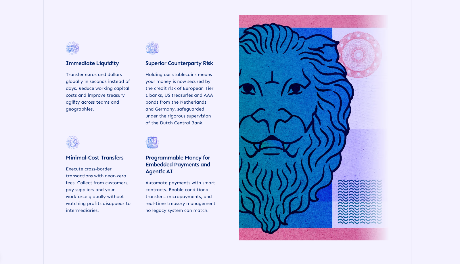
About the Client
Quantoz is a Netherlands-based fintech innovator and the first regulated issuer of stablecoins under Dutch Central Bank supervision. They empower businesses to leverage blockchain for real-world use cases, offering compliant infrastructure for programmable money, cross-border payments, and digital asset settlements.
Services
Challenge
As pioneers in regulated blockchain finance, Quantoz had a sophisticated offering but an outdated brand. Their previous identity lacked the clarity and modern polish needed to match the depth of their innovation and regulatory credibility.
They came to Coinbound to architect a brand transformation, one that could convey both technical expertise and institutional trust.
Solution
Coinbound led a deep-dive discovery and strategy process to align on positioning, values, and tone. With that foundation, we developed:
Results
Quantoz now stands out with a clear, confident identity that reflects its leadership in digital finance. The redesigned site acts as a polished hub for their mission and message.
The Quantoz brand system
Quantoz issues regulated digital euros and dollars, so the brand borrows the language of banknotes: fine guilloché linework, engraved numerals and a palette with Dutch roots.
Quantoz Payments became simply Quantoz: a cleaner, more confident wordmark that reads as an institution.
USDQ, EURQ and EURD each get their own mark, all built from the same Q.
A clean geometric sans for everyday reading, paired with an engraved serif that gives numbers the weight of printed currency.
Five primaries led by Catalina Black and Dutch Blue, with a warmer secondary set for campaigns and illustration.
The system holds up at every scale, from street-level billboards to a commemorative stamp.
A flexible template set that moves between product news, regulation milestones and market data.
A full redesign, built and launched to put regulated digital money front and center.